18.10.2016 (Week 8)
David Ho Ming Aun (0328394)
Advertising Principles and Practice
Advertising Message and Choice of Media
Lecture: Advertising message and choice of media
This week's lecture is quite interesting as it covered how the media can affect the message of the advertisement greatly. The terms media and new media were firstly defined, followed by media strategy and Integrated Media Communications (IMC). Lots of wonderful examples were shown where the medium of the advertisement proved to be vital in ensuring the effective delivery of the intended message.
Marshall McLuhan provides a bold quote: "The medium is the message." The five factors that are utilized in deciding a media strategy as outlined by Arens and Schaefer (2007) are outlined: Market, Money, Media, Mechanics and Methodology. This is conveniently known as the 5Ms, and we will be using this in Project 2.
Outcomes from the lecture:
- As important as the advertisement itself is, the medium on which it is placed upon plays an important role and has the potential to elevate the message.
- The difference between IMC and marketing strategy.
- The 5Ms in planning a media strategy.
In-class challenge:
Only this very brief brief was provided by our lecturer:
Here you go. You have one hour to mind-map, ideate, and digitize.
 |
| Figure 1: Brief for the Logo Design Competition |
We sat down together and began to try to make mind maps of things that represent Malaysia and New Zealand. We were not able to find any solid ideas or digitise it, but we managed to explore some possibilities to the executions.
 |
| Figure 2: Mind Maps (1/2) |
 |
| Figure 3: Mind Maps (2/2) |
We will be continuing to work on the logo through the weeks as it is incorporated into two of our modules, Advertising and Branding.
Project 2:
Secondary Research
I proceeded to study more in-depth about the different media and their suitability in relation to both my advertising campaign and the target audience, Generation Y. The following information is what I have mined and compiled. Do note that these are merely a collection of information — the synthesized and summarized information can be seen on the slides.
The article lists down many resources, and some facts:
In this site (http://smallbusiness.chron.com/print-media-advertising-advantages-3393.html) benefits of using print media to advertise are highlighted as such:
Project 2 Slides:
I proceeded to study more in-depth about the different media and their suitability in relation to both my advertising campaign and the target audience, Generation Y. The following information is what I have mined and compiled. Do note that these are merely a collection of information — the synthesized and summarized information can be seen on the slides.
Print Media:
I found a wealth of information from this article: https://contentequalsmoney.com/print_media_for_gen_y/The article lists down many resources, and some facts:
- 60% of Millennials said they’d cut their shopping spending if they didn’t look at newspaper inserts
- 91% said they use print coupons, ads, and sale notices to save money
- 51% said print ads inspire them to make a purchase
- 30% said they go online to find more information about a product after seeing it in a print ad
- a whopping 87% use print ads to select which restaurants to eat at
- 84% find coupons and discounts on clothing in print ads, and 71% shop ads to find the best price for apparel
To put some of these numbers in perspective, Valassis found that 86% of people in this age bracket visited Facebook on a daily basis.
In this article: http://www.npr.org/sections/gofigure/2012/05/02/151547286/millennials-and-print-newspapers-a-surprising-story it mentions a State of News Media study by Pew, which found that nearly a quarter of 18 – 24 year olds surveyed had read a newspaper in the past 24 hours. Millennials keep pace with total US adults until it comes to comparing the number of heavy readers. Less than a quarter of Millennials (22%) are reading newspapers at least every other day, compared to 40% of adults overall. However, 52% of them are getting their hands (and eyes) on a newspaper at least once a month and up to fourteen times a month.
In this site (http://smallbusiness.chron.com/print-media-advertising-advantages-3393.html) benefits of using print media to advertise are highlighted as such:
- Multiple Exposure: Newspapers can be re-read and exposure is not limited to a mere one-time event.
- Non-Intrusive: Not as intrusive as other media such as radio and TV and therefore the viewer won’t see is as much as an annoyance.
- Target Marketing: Can target specific target groups. This is especially the case with magazines.
- Loyal Readership: Longitudinal subscriptions and loyalty allow development of a
- long-term advertising campaign.
- Position Flexibility: Advertisers can usually choose where their ads would be
- placed within a publication.
Social Media:
A pessimistic start to my reseach, this study (http://adage.com/article/digital/study-1-facebook-fans-engage-brands/232351/) claims that "..lightly more than 1% of fans of the biggest brands on Facebook are actually engaging with the brands, according to a study from the Ehrenberg-Bass Institute, an Australia-based marketing think tank that counts Procter & Gamble, Coca-Cola and other major advertisers as its supporters."
Nevertheless, from this social networking fact sheet (http://www.pewinternet.org/fact-sheets/social-networking-fact-sheet/) it is reported that 92% of those in the 18-29 age group frequent sites like Facebook and Twitter, compared to the 73% of runners-up in the 30-49 group.
I found a really comprhensive dissertation by Tingley of Walden University, which can be viewed here: http://scholarworks.waldenu.edu/cgi/viewcontent.cgi?article=2215&context=dissertations.
This dissertation covers many areas, but here are some points that are relevant to using social media as a viable medium of advertising.
- In support of Fischer and Reuber (2010), 90% of participants in this study found Twitter an effective channel for marketing to Generation Y. Almost half (45%) of the participants mentioned Instagram, while 20% mentioned YouTube for their social media efforts. Patterson (2011) found that Facebook was a strong social media application for consumers; however, although 55% of this study’s participants showed support for Facebook, 30% were specifically against Facebook use when marketing to Generation Y. As one participant commented, “although still maybe Facebook is good for some and not for others, I think that Facebook is actually being utilized now more by the older demographics than the younger demographics” (P13).
- Huang et al. (2013) applied attitude toward the ad to viral videos and noted that Internet users are most likely to respond to or actively shareInternet content if they view the ad as entertainment.
- Slightly more than half (55%) of the participants responded to the importance of timing of social media usage and understanding what is new in the industry.
- In support of findings by Hadija et al. (2012), who stated that members of Generation Y will often only notice an advertisement for a split second, one participant found that “you have to think in little bits, we call it ‘snackables’ or bite-sized bits of information"
Ambient Advertising
Perception of advertising strategies - a qualitative study comparing Generation X and Generation Y: http://www.diva-portal.org/smash/get/diva2:721757/FULLTEXT01.pdf
The conclusion that can be inferred from this research is that Generation Y perceives ambient advertising better than Generation X, since they are more open for this type of advertising.
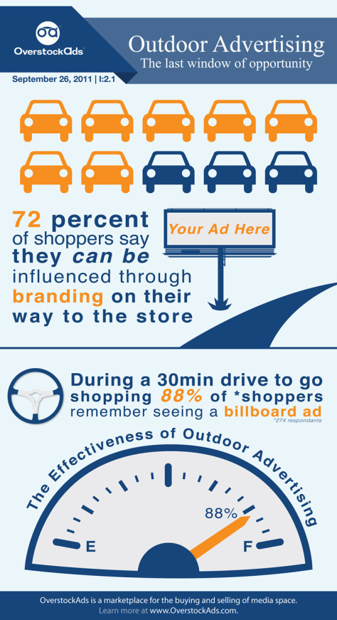
Billboard Advertising
The following infographic proposes some optimistic data and facts supporting the use of billboard advertisements.
 |
| Figure 4: Infographic on Outdoor Advertising |
(OverstockAds, 2011)
From this article by the Star:(http://www.thestar.com.my/news/nation/2016/05/17/malaysians-spend-more-time-in-traffic-jams-than-a-year-ago-says-ford/), it was said that:
"It was also found that Malaysians are spending more time in traffic gridlock than a year ago (2015), according to an online survey conducted by global carmaker, Ford. Of the 1,050 Malaysian respondents, 55 per cent of them said they spent more time in traffic."
The effectiveness of billboard advertising and the fact that Malaysians are spending more and more time in gridlock on the roads allow the billboards to play a larger role in advertising.
Web banners
Research findings have been looking down for web banners, with articles such as this one (http://www.tintup.com/blog/better-than-banner-ads-smart-ways-spend-ad-dollars-2015-muriel-macdonald/) by TINTUP stating that: "Modern day banner ads have a click rate of less than .1% (or 1 in 1000 people) which means you are more likely to complete NAVY SEAL training than click a banner ad."
However, in this article (http://adage.com/article/digitalnext/defense-banner-ads-hates-work/295782/) by Advertising Age written by Tom Goosman, chief creative officer at digital agency True North, the position of web banners is defended. I quote: "Many have declared that banners are ignored and ineffective. Behavior tells a different story. We see the banner's influence again and again. When we have stopped using banner display ads for clients, we've seen traffic, search and conversions plummet."
I think we can also see how the measure of the effectiveness of a web banner is not as valid as it can be. Measuring a positive value based on click rates does not account for the actual viewing of the advertisement, which could produce that edge that Goosman refers to in the article.
Having compiled all this data, I will now compile and summarise it neatly into the following Google Slides presentation.
Project 2 Slides:
Forum:
Question
Answer
The Media Mix refers to the types of media chosen to be utilised in an advertising campaign to achieve its objective. There are two distinct streams of media, the traditional media (print, radio, TV) and the new media (online social networks, websites). The interaction between these two mediums are not uncommon today and can prove to be effective in capturing the attention of the target audience.
The Integrated Marketing Communications, on the other hand, is a larger component that encompasses the Media Mix. The Media Mix is but a small part in the IMC, which includes aspects like timing, frequency, budget, and so on. The IMC is vital in the planning and coordination of the overall direction in which the advertising campaign will head, in accordance with the marketing strategy employed.
Feedback:
Specific Feedback
Good presentation. Citation and sources were abundant and supports your assesrtions and claims. Well crafted presentation and well presented (written form). Good work!
General feedback
Reflection:
Experience
I enjoyed the brainstorming sessions together, as we can really speed up the ideation process. I felt more confident with my chosen idea for the Playsafe advertising campaign after having shown it to the lecturer and classmates.
Observation
I notice that some classmates do not seem too motivated in voicing out their ideas or opinions, which can hinder creative thought and the overall process. I notice the lecturer being very tired these few days. I think he needs to take care of himself as well. I realise I am also quite forgetful, so I have begun writing things down more diligently in my notebook.
Findings
I have found that I tend to put my work off to the last minute, with my productivity levels reaching it's peak just before the deadline. I should probably try to do work more consistently to spread the load throughout the week.
Book of the Week:
 |
| Figure 5: Week 8 Book of the Week |
Hey, Whipple, Squeeze This! by Luke Sullivan
- Sullivan speaks of a quote by Alex Bogusky, who said: "We try to find that long-neglected truth from the product and give it a hug." Notice how he said 'find' and not 'invent'. It's very important to find the truest thing you can say about the product, to find the central human truth of a product.
- On idea generation: "Write hot. Edit cold." Get it on paper, fast and furious. Edit later.
- The book highlights an 'advertising legend' that Bill Bernbach carried a little note in his jacket pocket. Whenever he was having a disagreement with a client, he would take it out to remind himself. In small words, the sentence read: "They may be right."
- Very interestingly, Sullivan goes through the ways of presenting and defending your ideas, but then criticises the idea of testing an idea to your client. He argues that the idea of testing has the misconception of assuming people react intellectually to commercials, whereas in reality, reactions are something visceral and instantaneous. He provides a wonderful quote by Bill Bernbach: The quote is followed by the following paragraph: "We are so busy measuring public opinion, we forget we can mold them. We are so busy listening to statistics that we forget we can create them." The following in an excerpt from the section that immediately follows the quote: "This simple truth about advertising is lost the minute a focus group sits down to do its business. In those small rooms, the power of advertising to affect behavior is not only subverted, it is reversed. The dynamic of a commercial coming out of the television to consumers is replaces with consumers telling the commercial what to say."
Picture Credits
- Figure 1 : In-class Challenge Poster. Retrieved from https://times.taylors.edu.my/pluginfile.php/2437047/mod_resource/content/1/Logo%20Comp%20Flyer%20%28email%20version%29.jpg
- Figure 2 – 3 : Picture courtesy of Jessica Ngu Wei King
- Figure 4 : OverstockAds,. (2011). Outdoor Advertising Infographic. Retrieved from http://www.strategyr.com/MarketResearch/Infograhics_Images/MCP-1610/2.jpg
- Figure 5 : Personal Documentation
References:
- Corsini, T. (2015). How to Effectively reach Generation Y with Advertising: Bridging the Communication Gap. Marketricsgroup.com. Retrieved 22 October 2016, from http://marketricsgroup.com/wp-content/uploads/2015/03/company_white-papers.pdf
- Creamer, M. (2012). Study: Only 1% of Facebook 'Fans' Engage With Brands. Adage.com. Retrieved 22 October 2016, from http://adage.com/article/digital/study-1-facebook-fans-engage-brands/232351/
- Don’t Throw the Newspaper Out With the Bathwater: Print Media and Generation Y. (2013). Content Equals Money. Retrieved 22 October 2016, from https://contentequalsmoney.com/print_media_for_gen_y/
- Karlsson, S., Kälvehed, A., & Sköld, M. (2014). Perception of advertising strategies -a qualitative study comparing Generation X and Generation Y. Diva-portal. Retrieved 22 October 2016, from http://www.diva-portal.org/smash/get/diva2:721757/FULLTEXT01.pdf
- Pape, K. (2012). Millennials and Print Newspapers: A Surprising Story. NPR.org. Retrieved 22 October 2016, from http://www.npr.org/sections/gofigure/2012/05/02/151547286/millennials-and-print-newspapers-a-surprising-story
- Social Networking Fact Sheet. (2013). Pew Research Center: Internet, Science & Tech. Retrieved 22 October 2016, from http://www.pewinternet.org/fact-sheets/social-networking-fact-sheet/
- Tingley, C. (2015). Social Media Marketing Strategies to Engage Generation Y Consumers (Graduate (MA). Walden University.
- Tingley, C. (2015). Social Media Marketing Strategies to Engage Generation Y Consumers. Scholarworks.waldenu.edu. Retrieved 22 October 2016, from http://scholarworks.waldenu.edu/cgi/viewcontent.cgi?article=2215&context=dissertations
- Joseph, C. Print Media & Advertising Advantages. Smallbusiness.chron.com. Retrieved 22 October 2016, from http://smallbusiness.chron.com/print-media-advertising-advantages-3393.html
- Lum, R. (2012). What is Ambient Advertising?. Creative Guerrilla Marketing. Retrieved 22 October 2016, from http://www.creativeguerrillamarketing.com/guerrilla-marketing/what-is-ambient-advertising/
- Hatter, K. Why Is Billboard Advertisement Important?. Smallbusiness.chron.com. Retrieved 22 October 2016, from http://smallbusiness.chron.com/billboard-advertisement-important-36422.html
- Malaysians spend more time in traffic jams than a year ago - Nation | The Star Online. (2016). Thestar.com.my. Retrieved 22 October 2016, from http://www.thestar.com.my/news/nation/2016/05/17/malaysians-spend-more-time-in-traffic-jams-than-a-year-ago-says-ford/
- Patterson, A. (2012). Social-networkers of the world, unite and take over: A meta-introspective perspective on the Facebook brand. Journal Of Business Research, 65(4), 527-534. http://dx.doi.org/10.1016/j.jbusres.2011.02.032
- MacDonald, M. (2015). Better than Banner Ads: Smart ways to spend your ad dollars in 2015 - TINT Blog. TINT Blog. Retrieved 22 October 2016, from http://www.tintup.com/blog/better-than-banner-ads-smart-ways-spend-ad-dollars-2015-muriel-macdonald/
- Goosmann, T. (2014). In Defense of Banner Ads: Everybody Hates Them, but They Work. Adage.com. Retrieved 22 October 2016, from http://adage.com/article/digitalnext/defense-banner-ads-hates-work/295782/


