Week 1 – Week 3
David Ho Ming Aun (0328394)
Publishing 1: Print Media
Project 1: Page Layout Design
Brief
This was the brief provided by the lecturer.
 |
| Figure 1: Project 1 Brief |
Design Development
After pursuing some sketches, I realise that it is difficult for me to work on paper as it's not possible to be accurate and it takes a lot of time. I jumped straight into the digital process, using InDesign. The following are the scamps I have produced in chronological order.
 |
| Figure 2: Project 1 Scamp |
This scamp was a result of a strict grid system. This was just a warm up.
 |
| Figure 3: Project 1 Scamp |
This was an experiment on the horizontal alignment of elements.
 |
| Figure 4: Project 1 Scamp |
 |
| Figure 5: Project 1 Scamp |
This one played with the use of lines to reinforce structure, such as the introduction text.
 |
| Figure 6: Project 1 Scamp |
Taking the horizontal stressors further, I've tried adding lines across the gutter to exaggerate that.
 |
| Figure 7: Project 1 Scamp |
I tried text-wrapping an image under my lecturer's suggestion. However, the etch-out image looks very awkward.
 |
| Figure 8: Project 1 Scamp |
Lots of white space with little detailings at the title and introduction text. However, I found the right page too messy.
 |
| Figure 9: Project 1 Scamp |
Using a huge etch-out picture this time, I see how it can provide the unity between the pages, but lots of space is sacrificed for this, making the body copy look cluttered.
 |
| Figure 10: Project 1 Scamp |
I quite like this one, switching the orientation of the body copy and the captions to provide some interesting flow.
 |
| Figure 11: Project 1 Scamp |
This is a very classic attempt, very neat but I wanted to push it a bit more because it can be boring.
 |
| Figure 12: Project 1 Scamp |
Taking the title literally, I threw the textboxes into a mild perspective to really emphasise the point. However, I found it a little all over the place, but this is a concept worth revisiting at some point.
 |
| Figure 13: Project 1 Scamp |
Experimenting with borders and how it creates a sense of confinement, while the pictures break free from the confinement. Again, I found the etch-out awkward, and it's placement in the gutter is very risky.
 |
| Figure 14: Project 1 Scamp |
Here I use blocks of colour as the background to see how it would affect the flow.
 |
| Figure 15: Project 1 Scamp |
Here I try something a little bit more playful, playing with how the varying sizes of each letter can create a more interesting shape.
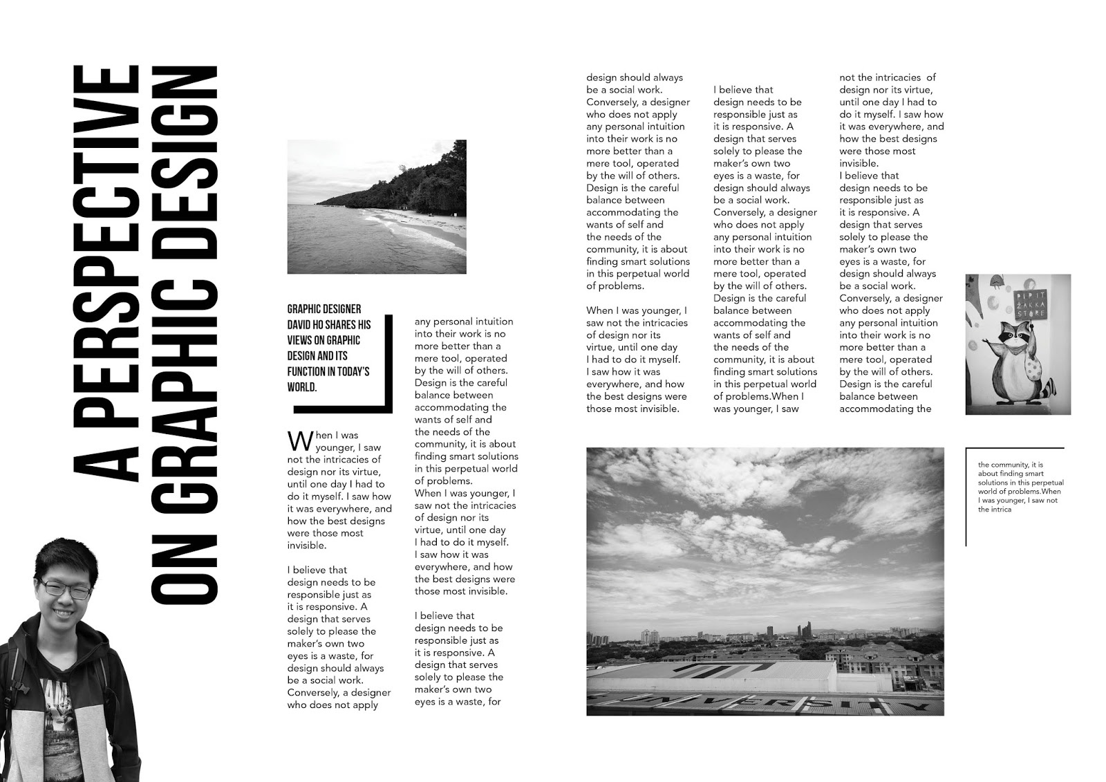
Project 1 Final Outcome
 |
| Figure 16: Project 1 Final Outcome (150ppi) |
Reflection
1. What was your main DESIGN DIRECTION?
I did not have a specific design direction right from the beginning, as I was focused on seeing how I can arrange my elements in an interesting way. As I progressed through my scamps I wanted to find a way to take the word "Perspective" literally and imply some sort of perspective within the design itself.
2. What was your main AIM in resolving this project?
My aim for the final outcome is for it to be bold and outstanding, but yet maintain a sense of balance despite the top-heaviness. I also wanted to ensure that the two pages meld together as one spread and work together well.
3. What were the tangible, measurable OUTCOMES that you achieved?
In my opinion, the message of perspective works well because of the gradually increasing point size of the title text. The bottom left portion plays an important role to balance out the very heavy title text. An addition of a small rectangle beside the captions on the bottom left corner helps ground the body of text, whereas the two squared-off pictures lend that region more visual weight. Placing the cutout image within the "V" of the title helps fill up what would have been an awkward region of white space.
4. What were your OBSERVATIONS?
I observe that my initial scamps had little to no sense of direction, with me just trying out variants of what I can do. It is only towards the end of the ideation process I had a goal to play with the word "perspective" where I began to create some work with more direction. I did not expect myself to produce such a piece as it is also not really reflective of my style, but I am glad I allowed myself to let this design flow out. The initial part is hard as the scamp-ing process is not as quick as in the previous exercises, so that was time-consuming and slightly frustrating. There were also issues with printing it out on foam board, as the sticker is a very sensitive thing that decided to warp under the heat of the car park, forcing me to reprint it. However, I enjoyed producing physical work that I could print out and feel as always.
5. Carry out some REFLECTIONS.
I've learnt that it's important to establish a design direction as early as possible because it helps me make designs faster and more effectively. Despite your best efforts in design, what's also important is to find a good printer! I definitely took a risk with this design, with such huge title text taking up half of my spread. But I am happy to how it turned out and it shows how calculated risks can work in my favour. In future assignments, I hope to explore more on creating spreads and to work in colour.
Image Sources
Figure 1 – 16 : Personal Documentation


No comments:
Post a Comment