Week 6 – Week 9
David Ho Ming Aun (0328394)
Publishing 2: Mass Communication
Project 2
Instructions:
Project 2 (20%)
The Brief
The Brief
The Book. (Part 2: Layout & Final Mock-up)
Duration of Assignment
4 Weeks (Briefing on week 5)
Deadline
Week 9 (22 May, 2017)
Description
After developing content (text and visuals) the next stage is to determine the format (size and binding method), and an appropriate & attractive layout based on a suitable grid system, choice of font/s and use of colour.
- Due to time constraints, the binding method shall be predetermined to be staple binding (saddle binding). The book is 32 pages, which is smaller than A4 and bigger than A5. However should you wish to try a different binding method you may do so with the permission of your lecturer.
- You will need to adapt a suitable grid system, choose a fitting font and create an attractive layout in InDesign.
- Your choice of colour must complement your visuals and play a role that is supportive but also create dynamism where needed. It is advised to limit the use of colour, as it could be distracting.
- You need to determine your paper type, for cover as well as inside pages. A visit to the paper factory Hiap Moh or Conqueror is advised.
The end result will be an actual size mock-up of the book with finishing that is of good standard.
Requirements
The student must utilise the accumulated knowledge from the exercises, lectures and from their own reading (library books and online sources) to guide them and inform them in their decisions.
The student must document the process (sketches, layouts, trial and errors) in their eporfolio and hardcopy portfolio. The student will be expected to submit the final mock-up in the hardcopy portfolio and the softcopy PDF uploaded or embedded unto the eportfolio. Create a separate folder in your Google Drive and store all files, artefacts, project submissions, etc. here.
Ensure all items are logically and chronologically ordered, labelled and dated.
Submission
- All gathered information (failures, successes, epiphanies, sketches, visual research, printouts, websites, images, charts, etc.) documented logically and chronologically in the A4 Clear Sheet hardcopy portfolio. The works labelled and dated.
- All gathered information (failures, successes, epiphanies, sketches, visual research, printouts, websites, images, charts, etc.) documented logically and chronologically in the eportfolio for the duration of the project in one post.
- Pictures of the final book mock-up, softcopy PDF uploaded or embedded unto the eportfolio. Label it as final so that it is clear that this is the final version.
- Final book mock-up in actual size and on the selected paper along with a complete thumbnail print out of all the pages.
Objectives
- To develop students ability to arrange various elements attractively in a book.
- To develop students ability to create a suitable grid system that allows them flexibility.
- To develop students ability to integrate text and visuals attractively.
- To develop students ability to maintain a consistent identity with acceptable variation.
- To develop students ability to use colour appropriately; supportive or dynamic.
Project 2:
Layout inspiration
I started off by looking for layouts that would complement the geometry of the illustrations that I have done.
The interesting use of white space in the book shown in Figure 2 appealed to me, and was quite a prominent driving force in my layout choices.
Typeface trials
I acknowledge there is a stark difference between seeing typefaces on screen versus holding them on a physical sheet of paper, so I printed out a large variety and compared them all.
I started off by looking for layouts that would complement the geometry of the illustrations that I have done.
 |
| Figure 1: Estd 1999, a final year student's dissertation project at Central Saint Martins. |
 |
| Figure 2: Unknown book found off Pinterest |
The interesting use of white space in the book shown in Figure 2 appealed to me, and was quite a prominent driving force in my layout choices.
Typeface trials
I acknowledge there is a stark difference between seeing typefaces on screen versus holding them on a physical sheet of paper, so I printed out a large variety and compared them all.
 |
| Figure 3: Typeface trials (1/3) |
 |
| Figure 4: Typeface trials (2/3) |
 |
| Figure 5: Typeface trials (3/3) |
I was torn between Lucida Sans Std, Stone Sans and Athelas, but I succumbed to Lucida Sans. A healthy clear sans serif.
Grid Systems
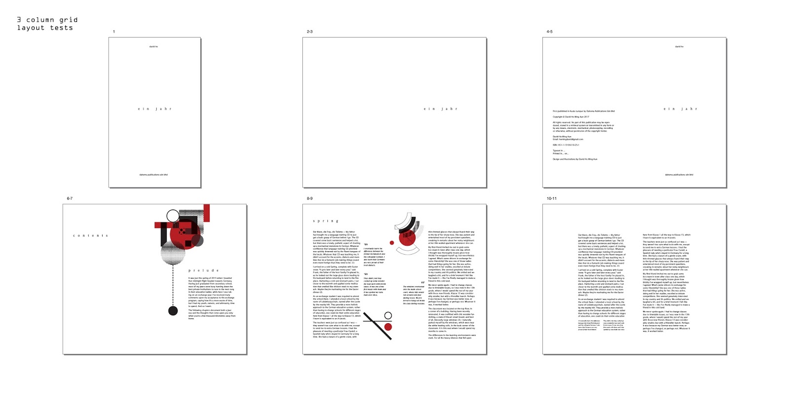
Time to choose the backbone of the book. I was deciding between 3 columns or 4 columns because the format of my book (150x245mm) is quite tall, but I tried out 5 columns just to see how it'll look.
A grid is pointless if I don't try to actually lay things on it, so for each grid I laid out (roughly) the first chapter's layout to get a feel of it.
The 3 column grid was a bit too restrictive in terms of allowing variations, and the 5 column grid is too clunky for such a tall format. I went ahead with the 4-column grid.
Time to choose the backbone of the book. I was deciding between 3 columns or 4 columns because the format of my book (150x245mm) is quite tall, but I tried out 5 columns just to see how it'll look.
 |
| Figure 6: 3 column grid. |
 |
| Figure 7: 4 column grid. |
 |
| Figure 8: 5 column grid. |
A grid is pointless if I don't try to actually lay things on it, so for each grid I laid out (roughly) the first chapter's layout to get a feel of it.
 |
| Figure 9: 3 column grid layout tests. |
 |
| Figure 10: 4 column grid layout tests. |
 |
| Figure 11: 5 column grid layout tests. |
The 3 column grid was a bit too restrictive in terms of allowing variations, and the 5 column grid is too clunky for such a tall format. I went ahead with the 4-column grid.
Initial Layouts
Here I tried to explore different ways I can lay it out that is slightly unconventional, but clearly some of them were too unconventional to work well. I liked the direction in the last spread (the bottom one in the middle row), and worked to expand on that.
Here I set the first chapter in that style and manner. Having shown my lecturer and obtained feedback from him, I went ahead with laying out the whole book.
 |
| Figure 12: Initial layout exploration. |
Here I tried to explore different ways I can lay it out that is slightly unconventional, but clearly some of them were too unconventional to work well. I liked the direction in the last spread (the bottom one in the middle row), and worked to expand on that.
 |
| Figure 13: First chapter layout exploration. |
Here I set the first chapter in that style and manner. Having shown my lecturer and obtained feedback from him, I went ahead with laying out the whole book.
 |
| Figure 14: Complete book layout draft. (1/2) |
 |
| Figure 15: Complete book layout draft. (2/2) |
I explore the cover options for the first full colour mockup.
Cover
 |
| Figure 16: Cover Exploration (1/3) |
 |
| Figure 17: Cover Exploration (2/3) |
 |
| Figure 18: Cover Exploration (3/3) I went with this one for my first full-colour mockup. |
Full colour Mockup
 |
| Figure 19: Full colour mockup layout (1/2) |
 |
| Figure 20: Full colour mockup layout (2/2) |
 |
| Figure 21: Full colour Mockup - Front Cover |
 |
| Figure 22: Figure 21: Full colour Mockup - Back Cover |
 |
| Figure 23: Full colour Mockup - Spread |
The lecturer was not too happy with the cover design, and also how the text looked in general. He asked me to rework the body text from two columns to three columns. This made sense because with the text in two columns, it felt very squished and it seemed very segregated. I applied the changes below.
Point size for body text was also decreased from 9pt to 8.5pt.
Final book:
 |
| Figure 24: Revised Cover. |

Figure 25: Spread
          |
| Figure 35: Final Layout. (1/2) |
 |
| Figure 36: Final layout. (2/2) |
 |
| Figure 37: Final Book - Front Cover |
 |
| Figure 38: Final Book - Back Cover |
 |
| Figure 39: Final Book - Spread |
Feedback:
Week 6
Layout is neat and conventional, typeface trials were tolerable, but encouraged to explore more on 'unconventional' layouts and 'experimental' stylings to provide a challenge for myself. Imprint should be placed beside contents page. More typefaces should be explored in regards to headings, pull quotes, etc.
Layout is neat and conventional, typeface trials were tolerable, but encouraged to explore more on 'unconventional' layouts and 'experimental' stylings to provide a challenge for myself. Imprint should be placed beside contents page. More typefaces should be explored in regards to headings, pull quotes, etc.
Week 7
Feedback? The layouts were fine, the section headers can afford to be smaller, balance of certain pages also needs to be considered. Was encouraged to look and aim for the 'edge' in the layout designs. Certain visuals were too large, needed more thoughtful balancing.
Week 8
Look into reducing point size for imprint text, body text. Ragging must be attended to. Page 6&7 looks too loose/fragmented. Some body text could be placed higher for consistent reading.
Reflection
Experience
Finally, we get to move on to actually setting up the layouts of the book! I initially started the project quite awkwardly, with the illustrations seeming too stiff and cold, but as I moved along the project the momentum slowly picked up, also due to the approaching deadlines set by the lecturer. As always, it is great to be able to print your book out in real life and hold it in your hands, but it always makes me nervous because the printers have a knack of screwing things up—Murphy's Law, you know? I experienced a great amount of stress over one particular weekend, due to several assignments all demanding my full attention. 'The nature of the beast' is indeed so, but I prefer when I had a firmer grip on the beast's leash.
Observation
I observe myself being a bit more sensitive to layouts, grids and typography more than before, which is great. I see myself having a deeper appreciation to typography. And in terms of process, as much as we all want to have originality plucked from the top of our heads, references are very good for me in order to ground or orient myself in a specific direction. I also note that nothing motivates more than a tight deadline, but it has also cost me my social life, family interactions as well as sleep. It's increasingly difficult to maintain quality throughout my modules, with each one demanding more and more time out of us.
I observe the lecturer being very tied up with his additional burdens, and I notice he brings that frustration into the classroom more often than before. He could use a good holiday.
Findings
I find that showing your work to other people helps, and I should do it more often, especially since we have a larger class now. I find that my design still tends to be too stiff, and I should really try to introduce more fluidity in my subsequent projects. I find that I am actually able to pull long nights, but I should at least take naps before attempting to drive.
Books
Image Sources:
Figure 1
Lim, S. (2015). Estd 1999. [image] Available at: https://www.behance.net/gallery/23070193/Estd-1999-An-Academic-Report [Accessed 3 Jun. 2017].
Figure 2
Anon, (n.d.). [image] Available at: http://imgcc.naver.jp/kaze/mission/USER/20140304/77/743697/267/625x1920x3fa537983c68ed4f626fa15.jpg [Accessed 3 Jun. 2017].
Figure 3 – 40
Personal Documentation
Books
 |
| Figure 40: Type on Screen |
Type on Screen by Ellen Lupton
“At last, here is one book that helps make sense of the shifting world of type on screen(s) for students of design and the people who teach them.”
Most of the books on typography which I have read on typography have been very traditional, talking primarily on the origins of letterforms and Gutenberg and standard print practices, but the moment I flipped open this book I knew I was onto something good.
Type on Screen provides an intriguing look into the new world of typography, in which letterforms find residence on flickering screens and adaptive mediums. This book contains so much new information that isn’t being taught in the current curriculum, which is slightly saddening because I feel this is very important for a designer of my generation. The eBook we are attempting to produce is a good step towards that, but I feel that we could ground the learning process on some theory.
Lupton covers a wide range of topics, ranging from typography, layout design, a touch on branding, information design and showcases a lot of interesting and recent case studies from both students and professionals. It can be lengthy to type out everything I’ve found, so I’ll provide my thoughts in point form:
- In her brief survey of web fonts, Lupton uses a criteria called ‘Amphibiousness’, which represents how well-optimised the typeface is for screen uses, along with how well-hinted it is. We are at the next step of typeface design—our fish need to grow legs now.
- Mutable typefaces provide a variable approach to typesetting, with each style in a font family being able to overlay upon each other to form unique letterform combinations. An example here is History by Peter Bil’ak.
- Digital publishing provides new ways of navigating, beyond mere left-to-right and up-to-down scrolling. It’s also interesting to note how our current primary form of navigation, scrolling, parallels that of one the most ancient form of the book—the scroll. Pretty obvious, but I just got it.
- Scalability of a icon isn’t a mere Command+T, but the icon needs to be designed in a way as to maintain legibility throughout the sizes. These are little things that I just never noticed but will now appreciate more.
All in all, it’s a very enlightening read and a good starting book for any designer who will be tackling typography on screen in the coming years.
Image Sources:
Lim, S. (2015). Estd 1999. [image] Available at: https://www.behance.net/gallery/23070193/Estd-1999-An-Academic-Report [Accessed 3 Jun. 2017].
Figure 2
Anon, (n.d.). [image] Available at: http://imgcc.naver.jp/kaze/mission/USER/20140304/77/743697/267/625x1920x3fa537983c68ed4f626fa15.jpg [Accessed 3 Jun. 2017].
Figure 3 – 40
Personal Documentation


No comments:
Post a Comment