David Ho Ming Aun (0328394)
Publishing 2: Mass Communication
Final Submissions and Links, Reflections
Instructions:
Submissions:
Exercises
Format Exploration
16-page Format Mockup (150x245mm)
Van der Graaf Grid (on A3 format)
Digital Van der Graaf Grid (on 150x245mm)
Signature Folding
Form and Movement Exercises
Format Exploration
 |
| Figure 1: Format Exploration |
 |
| Figure 2: 16-page Format Mockup |
 |
| Figure 3: Van der Graaf grid on A3 |
 |
| Figure 4: Digital Van der Graaf Grid |
 |
| Figure 5: Signature Folding |
Coptic Stich Binding
 |
| Figure 6: Coptic Stich Binding Top view |
 |
| Figure 7: Coptic Stich Binding Side View |
Identifying Grids:
 |
| Figure 8: Grid Identification 1 |
 |
| Figure 9: Grid Identification 2 |
 |
| Figure 10: Grid Identification 3 |
 |
| Figure 11: Grid Identification 4 |
Form and Movement Exercises
 |
| Figure 12: Form and Movement Exercise 1 |
 |
| Figure 13: Form and Movement Exercise 2 |
 |
| Figure 14: Form and Movement Exercise 3 |
 |
| Figure 15: Form and Movement Exercise 4 |
Project One
Text
Text
Illustrations
 |
| Figure 16: Project One Final Illustrations |
Project Two
 |
| Figure 17: Project Two Thumbnails (1/2) |
 |
| Figure 18: Project Two Thumbnails (2/2) |
 |
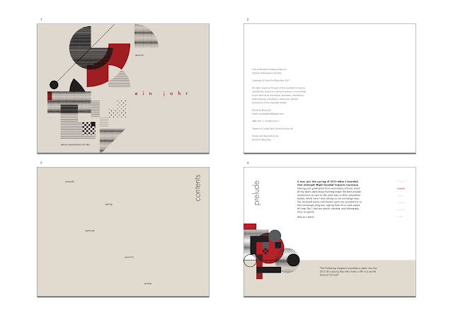
| Figure 19: Back Cover and Cover |
 |
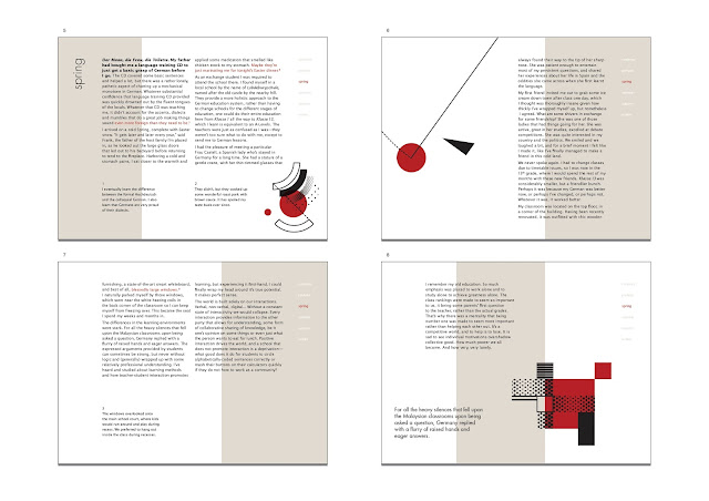
| Figure 20: Spread |
 |
| Figure 21: Spread |
 |
| Figure 22: Spread |
 |
| Figure 23: Spread |
 |
| Figure 24: Spread |
 |
| Figure 25: Spread |
 |
| Figure 26: Spread |
 |
| Figure 27: Spread |
 |
| Figure 28: Spread |
 |
| Figure 29: Spread |
 |
| Figure 30: Final Book (Front) |
 |
| Figure 31: Final Book (Back) |
 |
| Figure 32: Final Outcome (Spread) |
Project Three
Online Desktop eBook:
*Roll over the cover text for a cool animation!
iPad Version (1024x768px)
Thumbnails
Online iPad eBook:
*Click on the red body text!
iPhone 6 Version (750x1334px)
Thumbnails
Online iPhone eBook:
*Click and hold on the red body text!
Reflections:
Desktop Version (1366x768px)
Thumbnails:
 |
| Figure 33: Desktop eBook Thumbnails (1/2) |
 |
| Figure 34: Desktop eBook Thumbnails (2/2) |
Online Desktop eBook:
*Roll over the cover text for a cool animation!
iPad Version (1024x768px)
Thumbnails
 |
| Figure 35: iPad eBook Thumbnails (1/2) |
 |
| Figure 36: iPad eBook Thumbnails (2/2) |
Online iPad eBook:
*Click on the red body text!
iPhone 6 Version (750x1334px)
Thumbnails
 |
| Figure 37: iPhone 6 eBook Thumbnails (1/2) |
 |
| Figure 38: iPhone 6 eBook Thumbnails (2/2) |
Online iPhone eBook:
*Click and hold on the red body text!
Reflections:
Experience
The module ended early, as expected of modules headed by the lecturer. Upholding his reputation for following his timeline to a tee. As usual, the semester felt like it passed by very quickly, as of all things when we look back.
I'm not satisfied with my work. The final book had not given me the same amount of pride in my work as the previous semesters in my other modules, such as the magazine in Publishing 1, or the campaign in Advertising 2. I just cannot bring myself to say that I am proud of this piece of mine, because I know I have slacked in certain areas of it. I have not pushed any boundaries of mine, and this is extremely evident with the content of the book, as well as the illustrations that pair it. I take responsibility for my inactions, but I also must acknowledge the deadline provided that deemed insufficient for me to produce any acceptable work. The half-baked outcomes from Project 1 rippled through the semester, and I think that made the rest of the process feel blander. I tried to give it more spice through Project 2 with layouts and typography, but design cannot save bad content, especially for the pickiest client in the world—me.
This module (and other modules in general) are gradually swinging the limelight back to the students, getting us to think for ourselves. As a student from a typical Malaysian educational background, I find mild difficulty in being so self-oriented, in the sense that we have to decide our learning path for ourselves.
As much as I would have liked it, I could not devote my full attention to the conceptualization process in the beginning, due to some time management hiccups that I tangled myself into. I did not feel good about dividing my time and energy in so many directions, as I usually like to have enough room to be focused on one project at a time. I can't juggle that well. I rationed my efforts poorly in the beginning, and I do regret that.
The semester has been quite an emotional rollercoaster, and I find myself feeling deflated and defeated more often. I question myself and my abilities more frequently. At low points like these, I feel like I'm just a fraud, faking my way through this facade of being a 'designer'. Or maybe I'm just too harsh on myself as usual.
Observation
Despite the hell that is the Blogger interface, this e-portfolio is a good record of the progression that we have done throughout the semester. Always good to reflect on the past works.
As my lecturer had pointed out to me personally, my illustrations are lacking. Composition-wise they aren't really all that interesting, and I didn't really apply much thought to them. I was merely using my eyes to form the shapes, but I don't think I should have taken that approach. Ultimately, my illustrations lack humanity, for a subject that demanded humanity.
My eye for typography, in general, is developing. Looking back on previous works I can now see the typographical disasters in them, and this is a good sign! It means I can spot my errors better.
The lectures are good and very informative, and I have no issues with the learning style promoted by the lecturer. However, I notice that the lecturer does not really encourage a group-based learning as employed in his previous module I took, Advertising Principles and Practice. Group sharing was very much encouraged in that previous module, and I believe most of us found that beneficial because of the communal learning that comes with it. I found it a real pity that there was little to none of that in this class.
If anything, I observe myself getting tired more often. Maybe it's because I haven't felt the spark that comes with having a really good idea, the zeal that accompanies the feeling of pushing your work to new boundaries. I haven't been able to produce really good ideas for a while now, and that may be making this whole process feel all too mechanical.
I am very proud to see my classmates' works. Having seen their works in the first semester and looking at them now, it really shows how far they've come and how much they've improved. Which begs the question: Have I improved since? I feel like I have not improved much since I first joined this course, and I'm scraping against a ceiling. I understand the danger of that, and I must do something about it during the break.
Findings
I find that this module is a good lesson to me. I mean, on the surface it is merely taking us through the stages of creating a book and throwing it onto a digital platform, but I must not forget that designing is a human process, and it comes with very human lessons.
Here are some thoughts I need to chew on as I carry on: I should reevaluate my process and see how I can improve. I also need to consider how I measure improvement: is it through public approval or personal satisfaction? What is a good balance?
I find that this reflective prompting is beneficial if one takes it seriously, albeit time-consuming. It's always good to put thoughts down to 'paper' in order to solidify the thoughts that we have about both the assignments and ourselves.
Cheers.
Image Sources:
Figure 1–38: Personal Documentation


